E-commerce Case Study: Les Maisons Rouges, an organic winery
For this project, I worked on Usability Evaluation and Site Redesign with my teammates Yanis Azze, Anaïs Jardin, and Ahmad Khalaf.

Les Maisons Rouges is a vineyard located in the Vallée de la Loire in France, they make organic wines labeled AB and Biodyvin since 2009.
In order to launch this project and understand the objectives of our stakeholder, we interviewed Adrien, the winemaker and owner of Les Maisons Rouges.
Empathize
Through this interview, we were able to understand more easily major elements from his business.
- Customers: Adrien doesn’t have a special target but his customers are wine passionates, from all over France
- Supply chain: no supermarket distribution, only cellarmen (cavistes) and restaurant contact him, direct distribution at the vineyard
“I prefer when it is someone real that sells our wine: they are able to talk about it”
- Wine taste & description: complex and long in the mouth wines, Adrien doesn’t want too much description as “everyone has different tastes”
“How to describe a wine when it’s complex ?”
- “Agriculture Biologique” and “Biodyvin” labels: they are a pledge of quality
- Website: it helped him increase sales during Covid-19, indeed customers can no longer come to the vineyard and as most of his distributors are closed due to the pandemic situation, he had to improve the website and marketing efforts (e.g. discount code)
Still, Adrien thinks that the website and the user experience can be improved so it can bring more potential customers to buy.
What to improve on the website:
“It’s rustic”
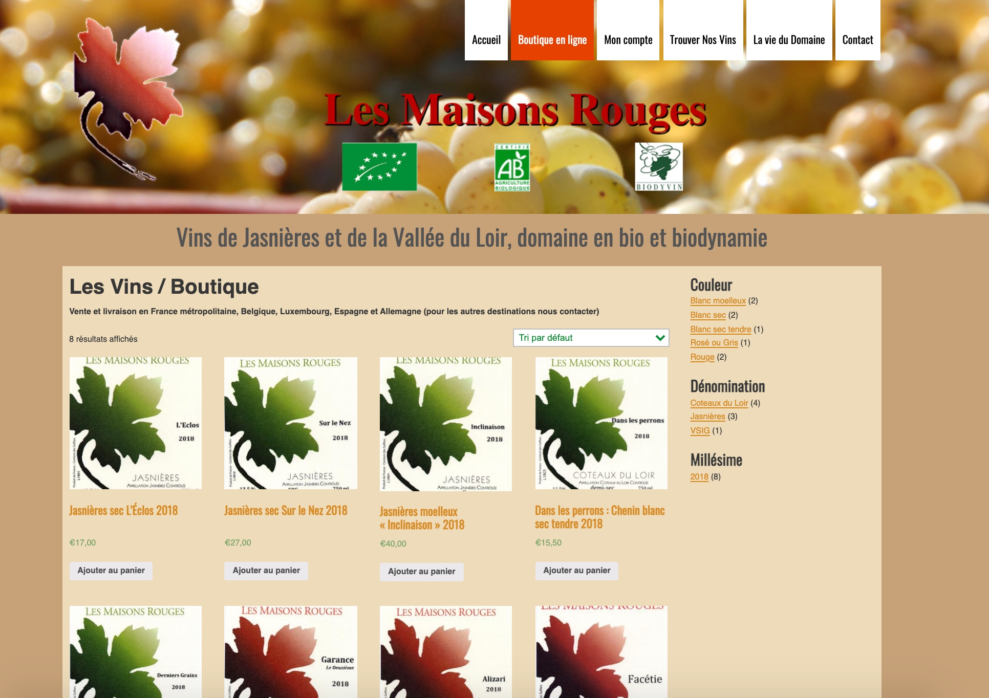
According to Adrien, the website is a bit old and not modern enough, he has some trouble with the cart and prices especially when it comes to Franco Port.
He wants his website to represents the wine, according to him it has to be: “sleek, straight, clean labels, minimalist, not too much load”.
He also wants to have bottles for his e-shop and not only labels.
Knowing the objectives of our stakeholder and understanding his main issues, we were able to help him and start this project in good conditions.
First, we had to assess what was the current situation of the website.
Heuristics evaluation
In order to improve the website, we review all the pages and noted what were the main issues in terms of heuristics.
This process helped us to assess the usability of the current design of the website.


We reviewed all the website using the Nielsen Heuristics tool, we listed all the issue we faced and the points that needed improvements. We gather all together what we noticed and listed the main problems :
- Lack of breadcrumbs
- Redundancy in pages
- Too much information in catalog
- Can’t see the number of products in cart
- Lots of unnecessary steps
- Inconsistency when resizing the viewport
- Unclear color and type scheme
- User does not know when he is logged into the account
- Lack of status on which page I am on
- Doesn’t warn me when deleting something from the cart
- Images of catalog are cut out
- No information about delivery price in the cart
After giving a severity level to each problem from 1 to 5, we provided some design advice to solve the issue.
Mainly 2 of the 10 rules of heuristics were not respected :
- Visibility of the System Status
- Aesthetic and minimalistic design
This were we had to focus on for our site redesign.
Sitemap & userflow
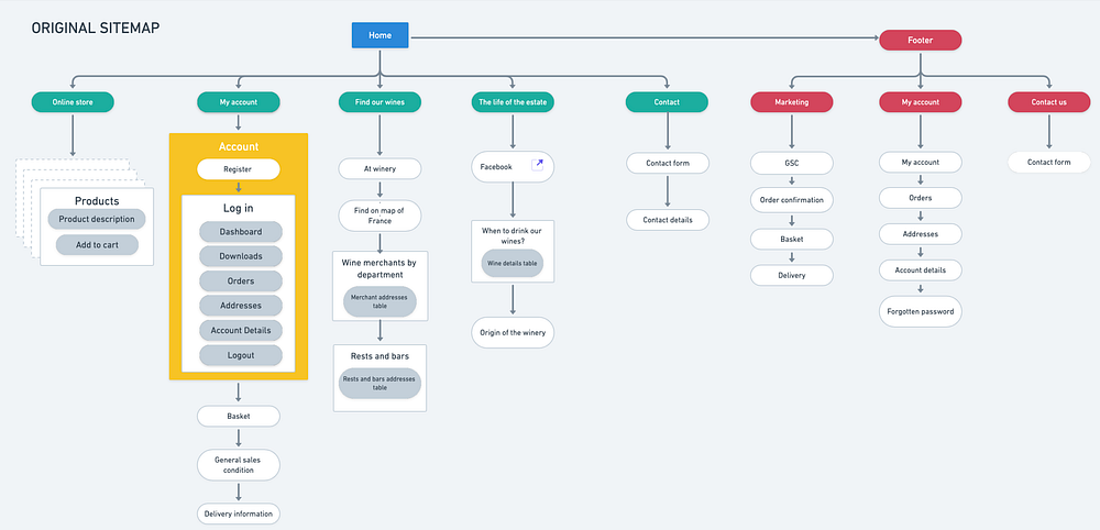
Before going on the redesign, we still needed to assess the site map of the current website in order to clarify the site’s goals and what we saw on the architecture before starting designing or creating content.

Thanks to this first mapping of the original sitemap, we knew exactly what we wanted from the original one to the new one, and what we wanted to erase or add. Mapping it out ensured that every part of the website is reinforcing Adrien’s goals.

We were able to cut parts that weren’t directly tied to the site’s purpose before they became an integral part of the site’s architecture.
Thanks to this new sitemap, we were able to make the user flow for purchasing wine on Les Maisons Rouges.
We add direct access to the boutique on the homepage so the user can review the suggestions of Les Maisons Winery but also to select the wine he wants to purchase.
Once selected and added to cart, the goal was to propose the user to buy wine without creating an account so he won’t get bothered by this registration process.
Now that we proceeded these assessments and that we were sure about what we wanted for this website, it was time for mid-fi prototyping.
Mid-fi prototype
We preferred to start with the mobile first, as it has more constraints that on the desktop, it will be easier after that to make it responsive.
So, we focused our work on the add to cart and purchasing flow as already explained in order to improve the user and purchase experience.
This mid-fi prototype allowed to us to test our design on users and to confirm or to modify some of the features we created.
Usability testing
For the usability testing part, we interviewed 5 people from different background and age.
During the test, participants were asked to go around the website and do a specific task which was adding wine to their cart and buy it.
While they were doing that, we took notes and recorded the testing session so we could gather the main feedback and also encounter the main problems they face during the test.
And the main feedbacks from our users were:
- Overall Small features : small texts and buttons, small cart — it wasn’t comfortable to see what was on it and the signing button was too small, some of them didn’t notice the “continue without an account” or the price at first sight.
“ I prefer scrolling that small features”
- Lorem ipsum was not clear and storytelling needed
- The boutique button on the homepage was not visible enough, they thought it was a wine coffret
The overall feeling of the users is that they wanted to buy wine after that and thought they were satisfied with the website.
Thanks to these feedbacks we were able to improve the mid-fi into a very good high-fi. But before that, we needed to define the brand so we can add the right colors to our final prototype.
Brand definition
The interview we did with Adrien — the owner of Les Maisons Rouges — before starting the project, allowed us to see what were their brand attributes and what feeling they wanted for their customers.
Mostly, Adrien wants to share his wine passion to others and make them feel that his wines are complex, vibrant and alive. These statements helped us understand the warmth of his brand but also to make the customers feel that it represents the wine well, for him it has to be “sleek, straight and minimalistic”.
That’s why we chose warm colors for the website.

And we applied these to our prototype.
High-fi prototypes:
Mobile
Desktop
Next steps
For this project, we still need to perform user testing on the high-fi and iterate to make the most of our design. Present it to our stakeholder and integrate some features like categories of wines and filters so if Les Maisons-Rouges creates more wine, the users would be able to sort them as they want.
Key Learnings
During this project, I was able to really deep dive into a brand and a business to understand what were their difficulties regarding UX, we were able to satisfy Adrien by respecting his brand and his goals but also to answer to user needs thanks to usability testing.
This reminds me my experience as entrepreneur. It made me realize that everything is connected, especially marketing and UX, if you have both of these tools in your hands you can create a powerful and user-centered business. And it rocks !
—
Thanks for reading, do not hesitate to give feedback !
